Pink Paint Mixing: How To Make & Vary Shades
Ever wondered how a simple mixture of red and white can unlock a spectrum of possibilities, from the softest blush to the most vibrant fuchsia? The creation and understanding of the color pink is a fascinating journey into the heart of color theory, offering artists and enthusiasts alike a powerful tool for expression and communication.
The allure of pink extends far beyond its aesthetic appeal. It holds deep cultural and psychological significance, influencing how we perceive and interact with the world around us. From the delicate petals of a rose to the striking hues of a neon sign, pink captivates and communicates on a fundamental level. This exploration delves into the secrets of creating pink, unlocking its versatility, and understanding its place in art, design, and the broader cultural landscape.
Let's embark on a journey into the world of pink, a world of possibilities where creativity and color intertwine, starting with the fundamentals: making pink.
The Genesis of Pink: Red and White
The foundation of pink lies in the simple yet powerful combination of red and white. This elementary pairing forms the core of the pink family. The ratio of red to white is the key to unlocking a myriad of shades, from the whisper-soft delicacy of baby pink to the bold statement of hot pink. Experimentation with these two hues is the starting point, providing a solid base for further exploration.
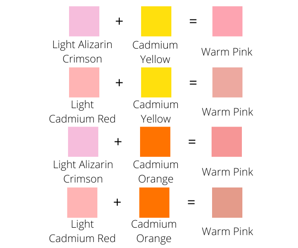
Adjusting the Temperature: Warm vs. Cool Pinks
Once the basic pink is established, the artist can begin to manipulate its temperature, or perceived warmth. This is where the magic of color mixing truly begins. To cool down a pink, a touch of blue or green is added. These colors sit on the cooler side of the color wheel, imparting a touch of serenity and sophistication. Conversely, to warm a pink, a tiny amount of yellow or even a touch of orange is introduced. These colors bring energy and a sense of vitality, creating a more vibrant and engaging hue.
The Role of Black in Pink
Black, often feared by the color mixer, can surprisingly enhance the depth and complexity of pink when used with a light touch. A smidge of black can deepen the shade, creating a muted, sophisticated pink or a slightly bruised, antique rose. However, a heavy hand with black can quickly muddy the color, so caution is advised. The best approach is to add it gradually, observing how it alters the pinks brightness and value.
The Impact of Yellow
Yellow is used to make pink warmer. It gives a pink the feel of vibrancy, making it more playful.
The Influence of Blue and Green
Blue and green can also be employed to modify the temperature of pink. The addition of blue results in cooler, more subdued shades, while green, in small amounts, can lend a muted, earthy tone, adding a touch of sophistication to the pink palette.
Mixing Chart for Color Models
The creation of pink involves different color models, each impacting how we perceive and create color. The color wheel is a fundamental tool in understanding these models, displaying the relationships between primary, secondary, and tertiary colors. Here's a brief guide:
Additive Color Mixing (RGB): Primarily used in digital contexts, like screens. In this model, pink is created by combining red and white light, the intensities of the light contributing to the final hue and intensity.
Subtractive Color Mixing (CMY/CMYK): This model is employed in the context of printing or painting. The magenta ink combined with white (or a white base such as paper) forms a pink. The addition of cyan and yellow can be used to manipulate the warmth and temperature of the resulting hue.
Color Mixing Chart
The color mixing chart can assist in creating various shades of pink. The chart is a visual aid showing how different colors combine to make pink. For example, you might start with red and white, gradually adding small amounts of blue to see how the hue changes. Similar experiments with yellow and black can show how those colors affect the pink's warmth, value, and brightness. This chart helps you to predict and adjust your color mixes more effectively.
Examples of Pink in Painting
Artists throughout history have skillfully used pink to convey a variety of effects. Think of the romantic flush in Gainsborough's portraits, the delicate blossoms in Japanese woodcuts, or the bold statements of modern art. Examples are the basis of showing the various artistic styles of pink.
Color Harmony with Pink
Pink is a versatile color that harmonizes beautifully with a wide spectrum of other hues. It can be paired with complementary colors (like green) for striking contrasts, analogous colors (like other shades of red or violet) for softer blends, or neutral colors (such as white, black, and gray) for a more subdued effect. The context and the desired emotional response dictate the perfect color pairings.
The Versatility of Pink in Design
The applications of pink in art and design are vast. Pink is a tool for expressing emotions and achieving various effects. Use pink to evoke feelings of passion, joy, or calm depending on the hue and context.
Pink's Psychology and Associations
The psychology of pink is as multifaceted as the color itself. It is often associated with love, tenderness, and femininity. Lighter pinks evoke feelings of peace, tranquility, and nostalgia, while brighter pinks can be energetic, playful, and even provocative. The cultural and historical associations of pink also play a significant role in its meaning, which will vary across different cultures.
The History and Symbolism of Pink
Pink's symbolism and use have changed over time. From its association with power and wealth in some historical periods, pink has evolved to have various meanings in the contemporary world. Understanding the evolution of pink's meanings enriches appreciation for how artists use it in their work.
Mastering Pink: Recipes and Techniques
Light Peaches: Start with a generous amount of white, add a small amount of red, and a touch of yellow to add warmth. The exact amount will depend on the paints used, and the goal is a soft, inviting peach tone.
Standard Pinks: Mix a base of red with a significant portion of white. Adjust the warmth by adding a speck of yellow or, for cooler versions, a touch of blue.
Magenta Pinks: Use magenta or a mix of red and a touch of blue. Add white gradually until the desired pink intensity is reached. The aim is a vibrant, striking color.
Neon Pinks: These are created by mixing fluorescent pink pigments with white, or by layering pink over a light base to heighten their brightness. Achieving a neon pink requires specific paint formulations to get the desired glow.
Shade, Tone, and Value
Shade: Adding black will lower the brightness of your pink. The effect is a deeper, richer hue, such as a rose or mauve tone.
Tone: Tone is a combination of color and a grayscale value. Changing the tone involves adding gray or a mixed gray (made from mixing complementary colors) to pink. This will soften the hue of pink. This is used to create softer pinks that work well in muted color palettes.
Value: White increases the value of a color. Adding white to red will create a pink. This change does not change the hue, but affects the brightness of the color. This technique is perfect for pastels, or for adding highlights.
Making Pinks: A Simple Recipe
1. Base: Begin with a clean mixing palette and a generous amount of white paint.
2. Red Addition: Gradually introduce red paint to the white, mixing thoroughly after each addition. The ratio will depend on the desired shade. A small amount of red makes a subtle pink, and more red yields a deeper shade.
3. Fine-Tuning: Experiment with adjustments to the mixture by adding yellow, black, or blue to alter the warmth, depth, or coolness of the pink. A tiny amount will go a long way.
4. Testing: Before use, test the mixed color on a spare piece of paper or canvas. This will allow you to see how the color will actually look when applied.
Color Temperature and Intensity
The temperature refers to whether a color appears warm (yellow, orange, red) or cool (blue, green, violet). The intensity is the purity or saturation of the color. A higher intensity means a more vivid color, and a lower intensity indicates a more muted or dull color.
The key to manipulating the intensity of pink is the addition of complementary colors to dull its intensity. Combining complementary hues will change its saturation level. To lower the temperature, add blue. The opposite is true: adding warm tones will create a warmer pink.
Choosing the Right Paints
Select red and white paints that meet your desired outcomes. For instance, consider the qualities of transparency and opacity, and the type of pigments used. The qualities of your paint (acrylic, watercolor, oil, etc.) will change the character of the pink created.
Additional tips
Use a mixing knife to evenly distribute the paints on your mixing surface.
Experiment with small amounts of color at first, before using a larger amount.
Record the measurements of your color mixing for future use.
Clean your brushes between color mixtures.
Final Thoughts
The journey of creating pink is a voyage into the fundamentals of color mixing, along with a celebration of its cultural significance. By understanding the interaction of red and white, along with how to adjust the shades, temperatures, and intensities of this color, artists can unleash a wealth of creative and communicative possibilities. From understanding the basic formulas to the subtleties of the color wheel, this knowledge of pink provides artists with a very vital tool of expression.
| Aspect | Details |
|---|---|
| Keyword | Pink, Color Theory, Mixing, Shades, Hue, Tone |
| Related Colors | Red, White, Blue, Yellow, Black, Magenta |
| Color Theory Concepts | Color Wheel, Primary Colors, Secondary Colors, Tertiary Colors, Additive and Subtractive Color Mixing, Color Temperature, Hue, Saturation, Value |
| Practical Application | Art, Design, Painting, Digital Graphics, Interior Design |
| Cultural Significance | Symbolism, History, Gender Associations, Cultural Perceptions |
| Materials | Acrylic Paint, Watercolor, Oil Paint, Pigments, Mixing Palette, Brushes |
| Reference | ColorMatters.com |


